When Maxis launched the fourth installment of their flagship life simulation game in 2014, players immediately noticed a dramatic departure from the seamless open-world layout of its predecessor. Instead of a continuous landscape, players were introduced to disconnected neighborhood zones managed via a centralized overview screen. However, comparing The Sims 4 old vs new world map reveals just how much the game’s core navigation interface has evolved over its multi-year lifecycle. What began as a muted, almost monochrome 2D blueprint system eventually transformed into a vibrant, fully illustrated map ecosystem that defined the modern aesthetic of the game.
This massive visual and functional transformation changed how players interact with their digital environments. Early adopters of the game will remember the stark, parchment-like appearance of Willow Creek and Oasis Springs, which lacked depth, contrast, and color. Over time, successive patches and visual updates overhauled the entire user interface, making world selection intuitive, colorful, and visually engaging. Understanding this evolution offers key insights into how game design balances performance optimization with visual appeal.
Overview of The Sims 4 World Map Evolution
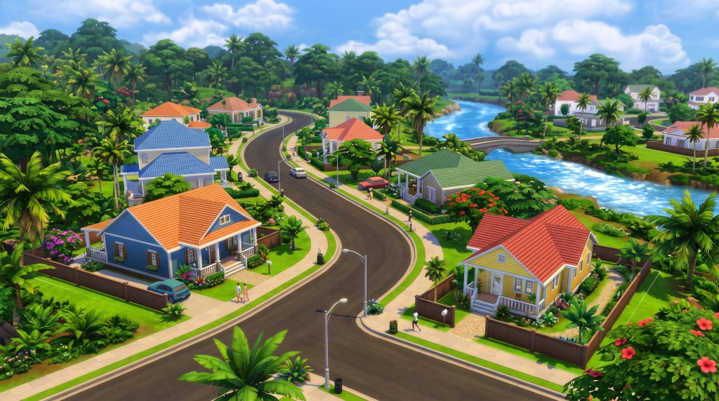
The history of world navigation in the game is marked by distinct design philosophies. At launch, the developers faced the technical challenge of ensuring the game could run smoothly on lower-end computers. To reduce system resource overhead, the original map screens were simplified drastically. This approach prioritized low render requirements over artistic flair, resulting in a minimalist user interface that felt disconnected from the rich, colorful world inhabited by the Sims themselves.
As the game matured and the engine received various performance optimizations, the development team reevaluated the user experience. The community voiced clear feedback: the map screen felt sterile and failed to capture the personality of individual neighborhoods. This marked the beginning of a multi-stage overhaul aimed at modernizing the game’s presentation layer.
The Launch Era: Flat 2D Map Design
During the initial release in September 2014, the world selection system featured a monochromatic, low-saturation look. Maps were rendered in soft blues, muted grays, and pale yellows, resembling architectural sketches or aged paper maps rather than living worlds. Lot boundaries were marked by thin, dark outlines, and the surrounding terrain lacked texture, depth, and distinct flora.
This design choice served a practical purpose: it loaded quickly and kept memory usage down. However, it had noticeable drawbacks for gameplay. It was difficult to distinguish between different terrain types, such as lush grass, desert sand, or concrete public spaces. Players often struggled to gauge lot elevation, river pathways, and neighborhood landmarks without directly loading into a specific household or venue. If you are curious about customizing these spaces further, check out our guide on how to build custom venues in The Sims 4.
The Patch Update: Transitioning to Vibrant 3D Illustrations
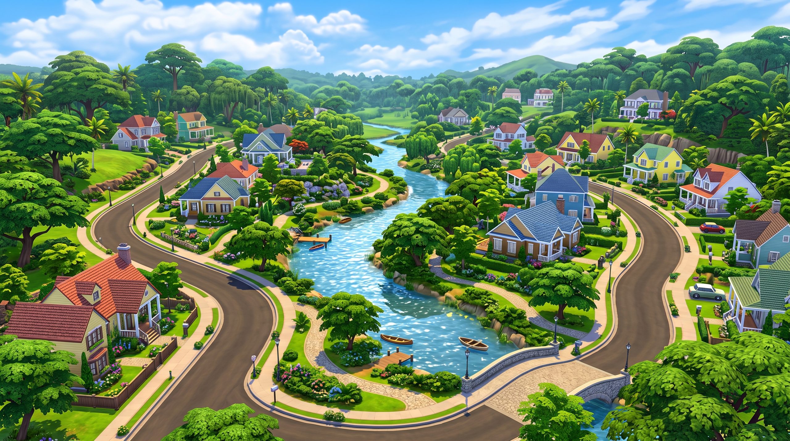
Recognizing the community’s desire for a richer visual presentation, Maxis rolled out a game-changing patch that initiated the full Sims 4 base game map refresh. This patch replaced the flat, blueprint-style overlays with fully colored, detailed 3D-style digital paintings. Trees became vibrant greens, water bodies gained realistic reflections and depth gradients, and desert rocks took on warm, sun-baked terracotta tones.
This redesign was more than a simple color swap. Every lot was re-drawn to reflect its true building footprint, surrounding environment, and real-time lighting context. Public spaces—such as parks, fishing spots, and neighborhood plazas—were clearly drawn with accurate pathways and vegetation. This update transformed the world map from a mere functional menu into an appealing centerpiece of the overall user experience.
Visual Comparison: Old World Map vs New World Map
To fully appreciate the scope of this transformation, it helps to examine specific worlds side-by-side. The original art direction relied heavily on desaturated overlays that made every environment look identical in lighting and mood. The redesigned maps, by contrast, celebrate environmental diversity and local architecture.
When comparing The Sims 4 old vs new world map art styles, the most striking difference is the sense of scale and life. The new illustrations introduce realistic shadows, atmospheric haze, and subtle details like animated water effects, custom neighborhood borders, and distinct foliage types that immediately tell the player what kind of climate and culture to expect.
Willow Creek: From Dark Monotones to Rich Greens
Willow Creek, the game’s flagship Southern-inspired neighborhood, suffered significantly under the old map design. Originally rendered in dark, muddy olive tones with washed-out riverways, it failed to convey the lush, swampy atmosphere of a bayou setting. Neighborhood districts bled into one another, making it hard to tell where Foundry Cove ended and Courtyard Lane began.
Following the major update, Willow Creek became a vibrant showcase of rich emerald greens, deep blue rivers, and clearly defined neighborhood zones. The Magnolia Blossom Park stands out with vivid flowerbeds, while the surrounding residential lots show clear lawn boundaries, paved roads, and distinct tree canopies. Players can immediately identify the swampy southern zones versus the upscale suburban hills.
Oasis Springs: Desert Realism Meets Stylized Color
Oasis Springs underwent an equally dramatic upgrade. In the 2014 launch map, the desert world looked flat, sandy brown, and washed out. The distinctive rock formations and canyon walls surrounding the neighborhoods were barely visible, appearing as faint gray smudges on the screen edge. The water features in the park and residential zones looked like flat blue stickers stuck onto a brown background.
The updated artwork brought true depth and color balance to Oasis Springs. The surrounding canyons now feature rich orange and red sedimentary layers, complete with highlights and cast shadows. The palm trees display vibrant turquoise-green hues, and the residential zones clearly show distinct terrain textures, from fine desert sand to manicured lawns around luxury mansions. For tips on modernizing lots in this world, read our article on renovating starter homes in Oasis Springs.
Newcrest: Blank Canvas with Enhanced Definition
When Newcrest was introduced as a free base-game update in mid-2015, it was designed as a completely empty world for builders. Its original map layout was extremely basic: fifteen blank lots set against a pale green backdrop with generic gray roads. While functional, it lacked charm and visual interest.
With the comprehensive Sims 4 neighborhood map update, Newcrest received a full artistic makeover. The background environment was filled in with realistic suburban details, including distant city skylines, lush tree lines, detailed sidewalks, and vibrant park areas along the central lake. This gave players a much better sense of context when placing custom builds or downloading creations from the Gallery.
Key Interface and Color Palette Changes in Neighborhood Maps
The evolution of the map system extends beyond world illustrations to encompass the entire user interface (UI). Interface usability is a critical factor in long-form simulation games, where players spend hours navigating menus, managing households, and rearranging lots. The shift toward modern UI standards required a complete rethinking of color palettes, contrast ratios, and iconography.
These user experience tweaks ensured that key information—such as which lots are occupied, which are commercial venues, and where your active Sim currently resides—is instantly recognizable even at a quick glance.
Contrast and Saturation Adjustments
The early UI relied on soft, low-contrast tones that often caused visual fatigue. Lot selection highlighted active lots with thin white lines that were hard to see against light-colored terrain. Venue icons were small, monochrome badges that required players to hover their mouse over the lot to determine its function.
The modernized UI introduced high-contrast visual cues across the board:
- Vibrant Background Terrain: Maps use higher color saturation to separate buildable land from non-playable scenery.
- Defined Lot Boundaries: Selected or hovered lots are framed by thick, clean, high-contrast borders.
- Dynamic Lighting Effects: World maps feature built-in ambient lighting that reflects the region’s climate, from sunny tropical islands to moody, misty valleys.
- Clarity in Waterways: Oceans, rivers, and lakes utilize deep blue hues and directional flow shading to improve spatial awareness.
Iconography, Lot Outlines, and Interactive UI Elements
Alongside color adjustments, the functional UI elements received a comprehensive redesign as part of a larger Sims 4 map UI visual changes initiative. Hovering over a lot now triggers a sleek, semi-transparent popup panel that cleanly displays household names, current Sim portraits, funds, lot value, and lot traits.
Venue icons were completely reworked from simple flat shapes into colorful, intuitive badges. Gyms, bars, parks, museums, and residential spaces each received distinct visual icons. Furthermore, when managing households, the active household is clearly marked with a green plumbob icon suspended directly above their house, removing any guesswork about where your main family lives.
How Expansion and Stuff Pack Worlds Were Updated
As the game expanded through dozens of Expansion Packs, Game Packs, and Stuff Packs, maintaining visual consistency across every world map became a significant task. Early DLC worlds were built using the older art guidelines, meaning they also required retrospective updates to match the modern design language introduced in later packs.
Modern DLC worlds—such as Henford-on-Bagley, San Sequoia, and Chestnut Ridge—were designed from day one using full-color, hand-painted digital artwork. However, earlier add-ons required dedicated patches to bring them up to modern standards.
Granite Falls and Windenburg Map Transformations
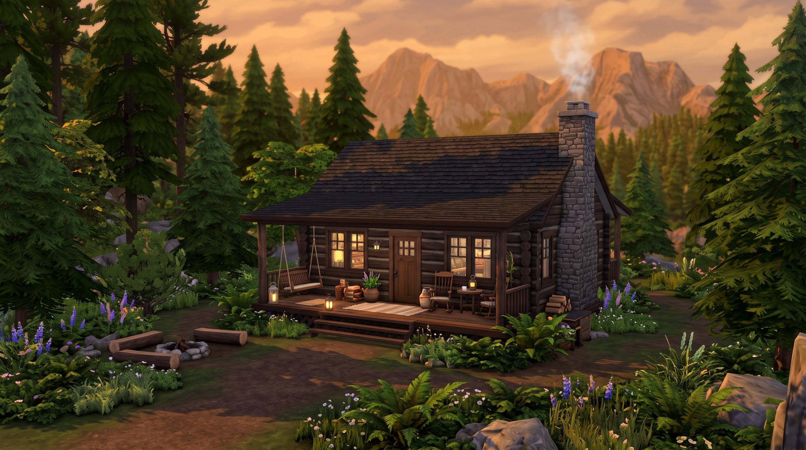
Granite Falls, introduced in the Outdoor Retreat Game Pack, was the first vacation destination added to the game. Its original map was heavily desaturated, rendering the dense evergreen forests in dull gray-green tones. The updated illustration replaced this with rich forest green foliage, crisp blue mountain lakes, and textured campsite paths, making the vacation destination feel inviting and immersive.
Similarly, Windenburg, the massive European-inspired world from the Get Together Expansion Pack, benefited enormously from artistic revision. With its multiple distinct districts—including the historic town center, the modern business marina, the countryside island, and the isolated ancient ruins—the new map artwork clearly highlighted the regional architectural variations across the landscape.
Maintaining Art Style Consistency Across Later Packs
To keep the game visually cohesive, Maxis established strict artistic guidelines for all subsequent DLC releases. Every new world map now undergoes a meticulous design process where concept artists hand-paint the map terrain to accurately reflect the 3D world geometry.
Key highlights of this unified art style include:
- Consistent Scale: Road networks, trees, and buildings are drawn in proportional scale to the actual in-game lots.
- Custom Environmental Details: Worlds like Sulani feature turquoise ocean gradients and coral reefs, while Mt. Komorebi shows snow-capped peaks and winding ski slopes.
- Integrated District Labels: World maps naturally incorporate distinct artistic flourishes to mark neighborhood boundaries without cluttering the screen with text.
If you enjoy exploring different pack locations, be sure to read our review on ranking the best expansion pack worlds in The Sims 4.
Navigation and Usability Enhancements for Players
Beyond visual changes, structural changes were made to how players move between worlds. In the original version of the game, traveling between different worlds was a clunky, multi-step process. Opening the map screen locked the player into a single world view, requiring multiple clicks to return to the global view to pick a new destination.
The modern map interface prioritizes seamless navigation, reducing loading screen triggers and simplifying the overall workflow for storytellers, builders, and casual players alike. When assessing The Sims 4 old vs new world map, usability improvements are just as impactful as the graphic upgrades.
Faster World Switching and Travel Mechanics
One of the most valuable structural updates was the introduction of the unified World Select screen. Instead of forcing players to navigate back through several sub-menus, a persistent global navigation button was added to the top left corner of the screen. This icon allows instant access to the entire list of available worlds.
These Sims 4 map navigation improvements fundamentally changed daily gameplay. Whether your Sim is visiting a lounge in San Myshuno, taking a vacation in Selvadorada, or heading home to Willow Creek, selecting the destination world requires far fewer clicks than it did during the launch era.
Clarity in Lot Types, Residential Info, and Venue Badges
Managing complex save files becomes much easier when information is readily accessible. The updated map screen consolidates lot data into clean panels. When you click on any lot, whether from the Manage Worlds screen or while organizing a travel group, the interface displays vital details instantly:
- Lot Dimensions: Clearly lists lot size (e.g., 30×20, 50×50, 64×64) so builders know if a lot fits their plans.
- Lot Value and Furnishing Status: Shows furnished vs. unfurnished purchase prices along with current lot value.
- Lot Traits and Challenges: Displays active traits like “Sunny Aspect” or challenges like “Off-the-Grid” directly on the hover menu.
- Household Residents: Displays high-resolution render portraits of all current residents, complete with their names and household funds.
Why EA Redesigned The Sims 4 World Map System
Redesigning a core user interface component in a live-service game with millions of active users is a major undertaking. Electronic Arts and Maxis did not make these visual and functional alterations purely for cosmetic reasons. The redesign was driven by long-term strategic goals for game stability, engine scalability, and brand positioning.
As the title shifted from a standard standalone release into a long-term platform intended to last over a decade, the original design framework proved inadequate for holding dozens of expansion worlds without becoming confusing or visually outdated.
Addressing Player Feedback and Visual Fatigue
Game design relies heavily on player sentiment and community engagement. Following the 2014 launch, community feedback repeatedly pointed to the map screen as a weak link in the game’s overall presentation. Players felt that the low-saturation blueprint aesthetic lacked warmth and charm, contrasting sharply with the bright, whimsical style of the actual gameplay.
By overhauling the visual presentation, the developers successfully eliminated visual fatigue. The color-rich maps made browsing neighborhoods fun and inspiring, encouraging players to explore worlds they had previously ignored due to uninviting map art.
Preparing the Game Architecture for Long-Term DLC Growth
From a technical standpoint, the game needed a flexible framework that could seamlessly scale alongside an expanding library of DLC packs. The original UI layout was rigid, designed primarily to accommodate the base game’s initial locations alongside a few immediate add-ons.
The overhauled map framework introduced scalable world selection grids, standardized map dimensions, and dynamic icon rendering. This architectural revamp ensured that whether a player owns two worlds or twenty-five, the screen remains clean, responsive, and easy to navigate. To learn more about organizing your game assets, read our detailed guide on managing custom content and mods efficiently.
Frequently Asked Questions
When did The Sims 4 update its world map design?
The primary visual overhaul occurred in July 2015 via Patch 21, which replaced the flat, monochromatic base-game map illustrations with fully colored 3D-style illustrations. Additional UI polish, iconography updates, and brand identity refreshes were rolled out in subsequent updates, notably during the major game-wide rebrand in July 2019.
Can you switch back to the original old world map in The Sims 4?
No, there is no official in-game toggle or menu setting that allows players to revert to the original 2014 map art style. However, members of the custom content community have created unofficial UI overhaul mods that restore the classic desaturated blueprint aesthetic for players who prefer the vintage aesthetic.
Did the world map visual update change lot sizes or locations?
No, the visual map redesign was strictly a graphics and user interface update. All lot dimensions, physical locations, road placements, and neighborhood boundaries remained completely identical to their original layouts. Only the artistic representation of those lots on the map screen was changed.
Are all DLC and Expansion Pack worlds included in the map redesign?
Yes. Early DLC worlds that launched prior to the redesign—such as Granite Falls from Outdoor Retreat and Magnolia Promenade from Get To Work—were retroactively updated with color art. All expansion and game pack worlds released after the patch were built from scratch using the modern, hand-painted illustrative map style.
Conclusion
The transformation of neighborhood navigation is a testament to how live-service game development can fundamentally elevate a game’s presentation long after release. Looking at The Sims 4 old vs new world map, the shift from flat, desaturated architectural blueprints to rich, hand-painted environmental illustrations completely modernized the player experience. By prioritizing high visual contrast, intuitive lot details, and seamless global navigation, Maxis transformed a plain system menu into an inviting gateway to virtual life.